

Averages, Errors, & Decimal Places
Understanding what the data is telling you

I am writing this post to address an issue I see come up again and again with some of the students and research teams I have consulted with over the past few years. Obviously my work is predominately related to electrochemistry and biosensing but this applies to analysing and presenting data in general.
In particular I am referring to how averages and errors are calculated and reported. For a lot a people this might seem trivial but some people may not give it much consideration. I think part of the issue is related to the reliance on graphing/analysing tools (Excel, Python etc…). It’s very easy to average a column of numbers, calculate the standard deviation, and generate a graph. For a lot of people that might be the extent to which their data needs to be analysed.
But not all averages and errors are the same…. And there is times when you need to think more deeply about what information you are trying to communicate and then select the appropriate analysis correctly. This also ensures you are drawing the correct conclusions from your results and planning your next steps appropriately.
For example, if you are using excel to calculate the error in your data set, which statistical analysis are you going to perform and why? Excel gives you plenty of options: Standard deviation (Excel = STDEV.S or STDEV.P), variance (Excel = VAR.S or VAP.P), the range (Excel = MAX(range)-MIN(range)) , mean absolute deviation (Excel = AVEDEV(range)), standard error of the mean (Excel = STDEV.S(range)/SQRT(COUNT(range)), coefficient of variation (Excel = STDEV.S(range)/AVERAGE(range)), confidence intervals, and so on….
Do you know the difference between these analysis types and when they are useful?
In this post I am going to show you (with a biosensing example) what statistical analysis you should perform, why you should perform it, and what the result is telling you. A lot of them you might never use but between the ones you do use you should have a good understanding what information the are actually portraying.
The Average Value
The importance of repeating experiments cannot be overstated. An isolated result is of little value, as our confidence that it accurately reflects the system under investigation is very low. Only when results are reproducible (time and again) can we have high credence in any particular hypothesis. But how do we communicate this confidence to our scientific colleagues and the wider public? We need a way of showing the results of all these repeats in a way that makes sense and is digestible. However, we need to make sure what we present is an accurate representation of the data collected.
When you are generating a calibration curve (signal vs analyte concentration) you typically take multiple replicates at each concentration. Three repeats is standard but the more you do the better estimate of the ‘true’ sensor response you will be able to get.
The average value of all these repeats is easy to find and typically in R&D you will only be concerned with calculating arithmetic mean. This is what most people automatically think in their minds when talking about average values.
Here, x¯ is the arithmetic mean (average) of the data set. It represents the “central” value of your measurements. In a biosensor calibration curve, this is typically the mean sensor signal for a given analyte concentration, averaged over replicates. ∑xi represents the summation of all individual replicate measurements. xi is the value of the ith replicate measurement (e.g. current, impedance, potential shift). n is the total number of replicates. For example, if you run 3 replicate biosensor measurements at a concentration, then n=3.
There are others ways to calculate average values such as the mode (most frequent value), the geometric mean ((∏i=1nxi)1n, dampens the effect of large values), the harmonic mean (n∑i=1n1xi emphasises smaller values)… but these are less useful for continuous calibration data and typically employed in other applications (categorical distributions, rates, ratios etc…). You could imagine using the median value (middle value when the data is ordered) when your data is skewed, or where outliers (e.g. bad electrode response) might distort the mean. But by and large the mean value is what you will be using.
Much more subtle and interesting (in my opinion) is how the error metric in this averaged value is reported.
The Error
For this discussion lets pretend we have developed an electrochemical sensor for measuring the free chlorine levels in swimming pools. The fabrication is complete and we want to generate a calibration curve to see how our sensor is performing.
We will test three chlorine concentrations: 1, 2.5, and 5 ppm.
We will use three electrodes in total and each electrode will be tested across the full concentration range (i.e. on electrode 1 we will test 1 ppm then 2.5 ppm then 5 ppm, and then do the same for electrode 2 and also electrode 3).
We will then look at the average response and the associated errors at each concentration across the three electrodes.
Current values are obtain by applying a potential and monitoring the resulting current response as a function of time (see chronoamperometry graph below). When the response stabilises the current values are then normalised to a baseline on each individual electrode and summarised in the table.
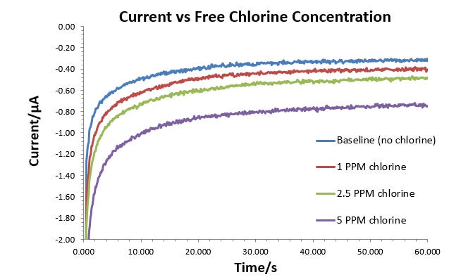
The mechanism of detection isn’t important for this example we just need some values to work with.
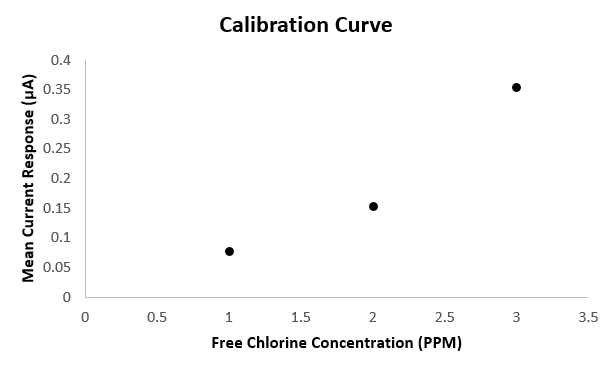
First lets calculate the average value (arithmetic mean) across the three electrodes for each concentration:
This allows us to generate a simple calibration curve for our chlorine sensor:
Now we need to decide how we want to represent the error across our measurements and also how many significant figures we should use. The table below summarises the most common ways to summarise variability and report confidence intervals in our results:
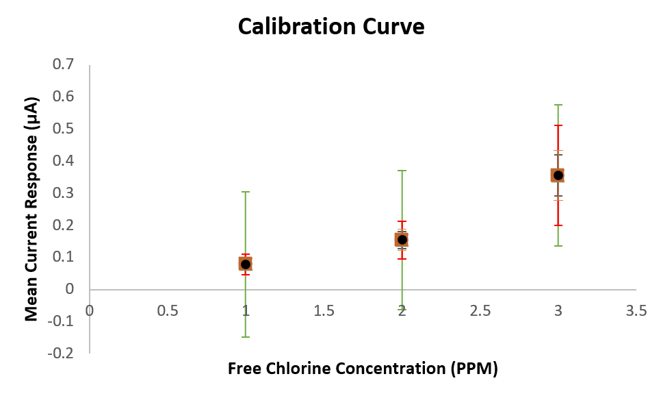
You can see that the different error calculations produce significantly different values… which could end up telling vastly different stories when shown in a presentation.
I know its a bit messy… But you can see in the calibration curve below how much the error bars can vary depending on how you choose to analysis the data.
Lets look at each error metric and understand when to use them and what information they are actually telling us.
If you find this content valuable for just £3.50/month, you'll unlock full access to everything Electrochemical Insights has to offer.